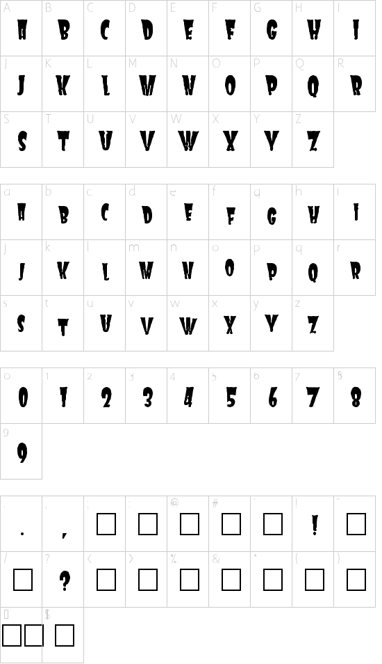
Thanks for downloading FRANKIE.
Patched together from a couple of other things I was working on, FRANKIE is evocative of other (better) horror fonts. If you want all your text aligned to the same baseline, use all caps. If you want something wackier, try the lower case characters; they're roughly 85% smaller than the upper case letters, and set at arbitrary distances from the baseline. Use it for Halloween flyers, or letters to the mother-in-law. Enjoy!
This font is free to use in all your designs and layouts. FRANKIE may be duplicated and given away as often as you see fit, as long as you INCLUDE THIS README FILE. If you use it for a professional printed job, I'd be floored.
Please take a moment to mention where you found FRANKIE and feel free to comment or criticize, care of "[email protected]"
DISCLAIMER (this notice MUST be included with any distribution):
No guarantee of any kind is made that FRANKIE will work on your machine. Dave Bastian MAKES NO WARRANTIES, EXPRESS OR IMPLIED, REGARDING THIS FONT. Dave Bastian DOES NOT WARRANT, GUARANTEE OR MAKE ANY REPRESENATIONS REGARDING THE USE OR THE RESULTS OF THE USE OF THIS FONT IN TERMS OF ITS RELIABILITY, OR OTHERWISE. IN NO EVENT WILL Dave Bastian BE LIABLE TO YOU FOR ANY DAMAGES ARISING OUT OF THE USE OR INABILITY TO USE Frankie. So don't come after _me_ with any torches. This font is worth every penny you paid for it.
Other free fonts available at
|
